
Frame by frame: telling a story in three slides
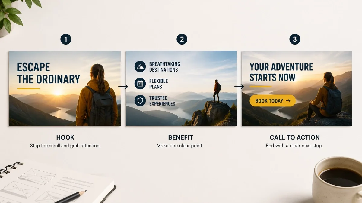
A banner ad is a story told in seconds. Nobody visits a website to look at the ads, so every banner is performing for an audience that is actively trying to ignore it. The ads that work accept this and behave like good storytellers: they open with something worth noticing, make one clear point, and end with an invitation.
Why frames suit the job
Frame-based animation, the kind JUMI Ad Animator is built around, treats an ad as a short deck of slides. Each frame holds on screen for a duration you set, then the next takes over. That constraint is a gift: it forces you to break your message into steps, and steps are exactly what a glancing viewer can absorb. One idea per frame, a few seconds each, and the whole thing loops.
The classic three-frame arc
Most effective display ads follow the same shape, and it fits neatly into three frames:
- Frame 1, the hook. Stop the scroll. Lead with the problem your audience recognises or the promise they want: "Paying too much for hosting?" or "Summer sale, up to 50% off". Big type, minimal clutter, no logo lecture.
- Frame 2, the benefit or proof. Earn the click you are about to ask for. This is the place for the key benefit, the headline number, the product shot or the customer rating. One supporting point, not four.
- Frame 3, the offer and call to action. Make the ask unmissable: the deal, a button that looks like a button ("Shop now", "Get the guide"), and your logo. This is the frame people act on, so give it the longest hold.
Three frames is a guideline, not a law. A simple promotion can land in two; a product story might need four. But if you find yourself sketching frame six, you are probably writing a landing page, not an ad.
Timing: let people actually read it
A good default is 2 to 3 seconds per frame, and longer wherever there is more to read. Read each frame aloud at a relaxed pace and add a beat: if you cannot finish comfortably, the viewer cannot either. In the editor, every frame has its own duration, so a five-word hook can flash by in 2 seconds while a frame with a rating and a price holds for 4.
Remember the ceiling, too. Google's display guidelines allow roughly 30 seconds of animation, and the ad must stop after a few loops. A three-frame ad at 2.5 seconds each loops comfortably within that budget.
Continuity: change only what matters
Because each frame is designed separately, it is easy to accidentally make three unrelated posters. Fight that. Keep the background colour or image consistent across frames, anchor your logo in the same corner throughout, and reuse the same fonts and palette. When the slide changes, the viewer should perceive one ad progressing, not a slideshow of strangers. The most polished ads change only the element that carries the story, the headline swaps, the price appears, the button arrives, while everything else stays put.
Cut or Smooth?
Ad Animator's default transition is Cut: one slide replaces the next cleanly, with no tweening. For display networks this is almost always the right choice. It is how real ad-network banners behave, it reads as confident rather than gimmicky, and it keeps exported files small because no in-between frames are generated. Small files matter enormously when your GIF has to squeeze under a 150 KB limit.
Smooth earns its keep in different territory: social posts and stories, where file weight rules are relaxed and a little motion helps a video feel alive. Subtle glides between frames can look lovely in an MP4 export. Just resist the urge to make everything fly.
Mistakes to design out
- Too much text per frame. If a frame needs a paragraph, it needs to become two frames, or the point is not sharp enough yet.
- Every frame shouting. If all three frames are maximum urgency, none of them is. Build to the offer.
- A blink-and-miss CTA. If the call to action is only visible for a second of the loop, most viewers will never see a reason to click. Give the final frame the longest duration of the set.
Related: How frame animation works · Exporting ads for every platform