
The banner sizes your campaign actually needs
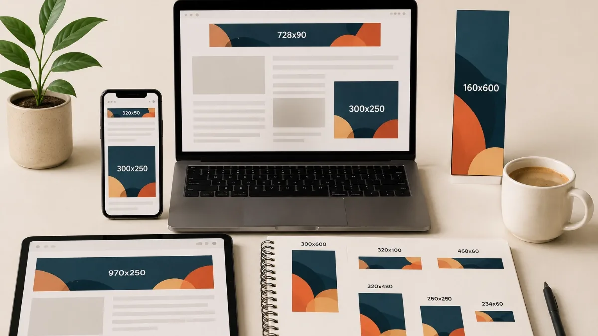
Open any ad platform's spec sheet and you will find a couple of dozen banner dimensions staring back at you. You do not need them all. Most campaigns do most of their work through a handful of sizes, and the rest are additions you make for specific reasons, not defaults.
Start with the workhorse trio
If you make only three banners, make these:
- 300×250 medium rectangle. The most ubiquitous display size there is. It sits inside article text and sidebars, works on desktop and mobile alike, and gives you enough room for a real headline, an image and a button.
- 728×90 leaderboard. The classic strip across the top of desktop pages. Wide and shallow, so it rewards a single line of copy with the CTA alongside.
- 320×50 mobile banner. Small, unglamorous and everywhere on mobile web. Design it as a one-liner: a few words and a button, nothing more will fit legibly.
Between them, these three cover in-content, top-of-page desktop and mobile placements: the bulk of standard display inventory. Launch with them, look at where your impressions actually serve, and expand from evidence rather than from the spec sheet.
When to add more
Three additions earn their keep most often:
- 300×600 half page and 160×600 skyscraper: the tall formats that live in sidebars and stay on screen as the reader scrolls. The 300×600 in particular tends to be a strong performer when budgets allow, because it offers real visual space.
- 970×250 billboard: the large-canvas format at the top of premium desktop placements. Worth making when brand impact matters and the campaign is buying that kind of inventory.
On mobile, the 320×100 large mobile banner is the natural upgrade from the 320×50: double the height buys you a readable second line or a bigger button on the same placements. It is a cheap addition because the design translates almost directly.
Beyond those, sizes like 336×280, 970×90, 250×250 and 468×60 exist and serve, but treat them as opportunistic extras. If a specific publisher or report shows demand, add them then. The full dimension-by-dimension reference lives on our banner sizes page.
Social sizes are a separate track
Square posts (1080×1080), stories (1080×1920), link-preview landscapes (1200×628) and their cousins are not banner ads: they are social creatives with different proportions, different viewing habits and usually a different export format (MP4 rather than GIF). Plan them as their own small set alongside the display set, not as afterthought resizes of a leaderboard. The same three-frame story usually translates well; the layout has to be rethought for the shape.
Why standard sizes win
It is tempting to invent a dimension that fits your design. Resist it. Ad networks auction standard IAB and Google Display sizes, which means a 300×250 can serve on millions of pages while a 297×253 can serve on none. Standard sizes get more inventory, more competition among placements, and fewer approval headaches. Custom dimensions belong on your own website, in newsletters, or anywhere else you control the slot.
Build the set in one project
The practical pain of multiple sizes used to be remaking the same ad five times. In JUMI Ad Animator a project holds a whole multi-size ad set: add the sizes you need from the built-in Google Display and social presets (or any custom dimensions up to 4000×4000), design one size properly, then use Copy & fit to scale that design onto every other size in the set. You will still want a minute per size to nudge type and crop images for the new proportions, but the heavy lifting is done. Export the lot when you are finished: GIF or HTML5 for the display sizes, MP4 for the social ones.
Related reading: How to make a banner ad, step by step · Exporting ads for every platform