
How to make a banner ad, step by step
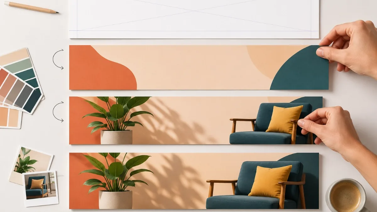
A good banner ad is not a small poster. It is a tiny, timed argument: a few seconds to earn a glance, make one point, and offer one thing to click. Here is the whole process, from blank canvas to files you can actually ship.
1. Decide the one message
Before you open any tool, finish this sentence: "When someone sees this ad, I want them to think ______." One offer, one product, one date. If you have two messages, you have two ads. Banners fail most often not from bad design but from trying to say everything at once, and a viewer scrolling past gives you roughly a second to register anything at all.
Write the message down, along with the exact words for your call to action. "Shop the sale", "Book a viewing", "Get the guide": short, verb-first, specific.
2. Pick your sizes
You do not need every size on the spec sheet. For a first display campaign, three placements cover most of the available inventory: the 300×250 medium rectangle, the 728×90 leaderboard, and the 320×50 mobile banner. Add more later if reporting shows you are missing impressions.
In the editor you can add all three as one ad set, design the 300×250 first, then use Copy & fit to scale the design across the other sizes and tidy up from there. For a fuller picture of what each size is for, see our guide to choosing banner sizes.
3. Write the three-frame story
Animated banners work best as a short sequence of slides rather than one busy image. The classic structure is three frames:
- Hook. The attention-getter: the problem, the headline offer, the striking image. "Winter sale: up to 50% off."
- Benefit. The reason to care, in one line. "Every coat, every colour, free returns."
- Call to action. The button frame: your CTA text, your logo, and not much else.
Ad Animator's built-in templates (retail, real estate, travel, SaaS, events, restaurant) all follow this hook, benefit, CTA shape, so starting from one gives you the structure for free and you just swap in your own words and images.
4. Design so it reads at a glance
- Contrast first. Light text on a dark ground or the reverse; if you squint and the headline disappears, fix it before anything else.
- Big type. A banner is viewed small and far away. Fewer, larger words beat a paragraph every time.
- One button. A single CTA button, styled like a button, on the final frame at least. Two buttons split a click that was never guaranteed.
- Shade your photos. Text straight over a photograph is a legibility gamble. Add a mask or shade overlay behind the text so it holds up on any image.
- Keep the brand present. Logo on every frame or at least the last one, so the ad still works for people who never click.
5. Get the timing right
Give each frame about 2 to 3 seconds. Faster feels frantic and gets cut off mid-read; slower risks the viewer scrolling on before your CTA ever appears. In the editor every frame has its own duration, so you can hold the hook a touch longer and keep the CTA frame snappy. Clean cuts between frames (the default in Ad Animator) are how most real ad-network banners behave, and they keep exported files small; save smooth tweening for the occasions that genuinely benefit from it.
Mind the network rules too: Google's display guidelines allow roughly 30 seconds of animation with limited loops, so a three-frame loop at a few seconds per frame sits comfortably inside the limit.
6. Export for each network
Different destinations want different files, from the same design:
- Animated GIF for display networks: it is the animated image format they broadly accept. Use the target-size control to aim under Google's 150 KB weight limit.
- HTML5 banner package for Google Ad Manager and most modern ad servers: sharper text and smaller files than a GIF at the same size.
- MP4 for social feeds, and PNG or JPG stills anywhere a static fallback is asked for.
Not sure which applies to you? GIF vs MP4 walks through the trade-offs.
7. Test before you ship
Play the exported file at its real size, not zoomed in. Check that every frame is readable in its allotted seconds, that the file weight is under your network's limit, and that the click destination matches the promise in the ad. Then upload one size, confirm it is approved and serving, and roll out the rest of the set.
Related reading: The banner sizes your campaign actually needs · GIF vs MP4: which format your ad actually needs